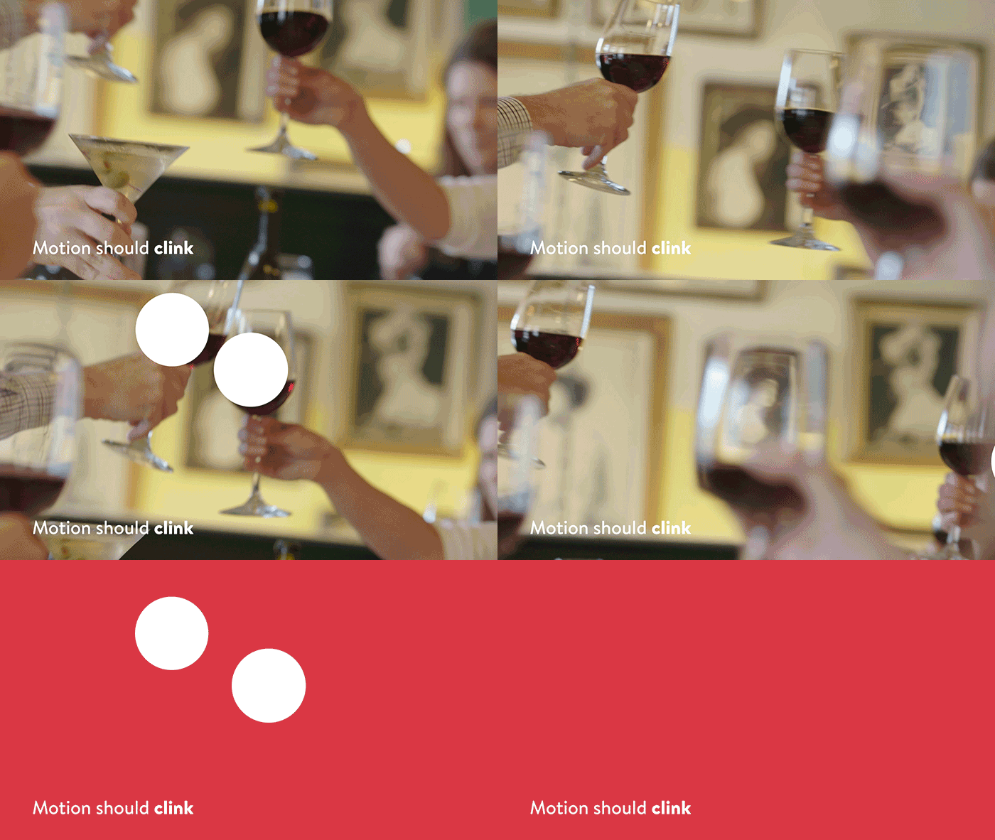
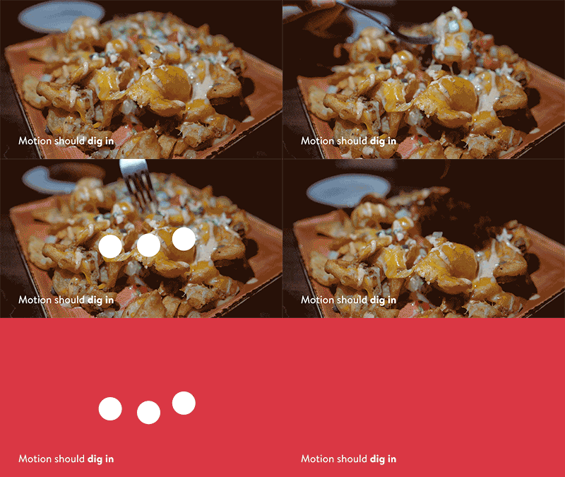
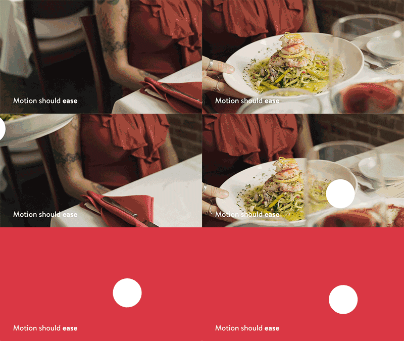
At the end of 2020, our lead content writers created a new manifesto to guide not only design, but every inch of OpenTable.

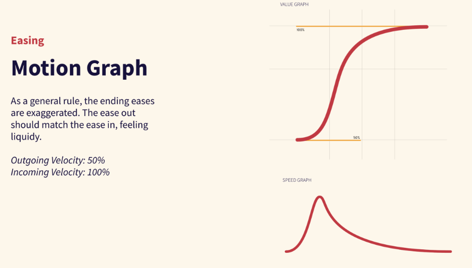
Inspired by the movement in the language, I knew it was time to establish brand guidelines for how OpenTable animates—not just online or on TV, but within the app as well, where possible.


Rather than cutting between shapes, morphing shows off variety with ease. There should always be enough time between shapes to ease into place.

Directional movement is rooted in gravity; the effort to leave should be matched by the effort to arrive.

Scaling with great ease adds confidence and magic, and is fundamental in showcasing various product features, or moving between scenes.

By default, text should rise and fall with ease from the bottom, beneath a mask.
